About code quality
When you read a text on a wide screen from some point on it becomes less fluent to read it if the text is not broken into columns. Even if it is broken you usually need more space in vertical than you have to avoid scrolling to much. Short story is: that's the way why I have the panel on the (left) side of my desktop on my 1280x800 laptop screen.
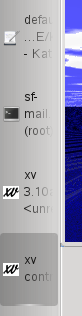 Now you have a taskbar showing your apps. The default layout puts the icon left of the text, which is reasonable for horizontal panels. For vertical panels it indeed sucks as you can see on the right. That's the main reason I filed bug 168855.
Well, tonight I felt a bit bored and thought of getting things better. You can see the results (which is just a crude hack) as attachment in that bug, but the point is: I never had done anything in kdebase and it took me only 2 minutes to find the correct directory (I first looked into pager, I always get this wrong) and another 5 minutes to find the right position in the code to change. I only opened two wrong files before finding the right one (one in pager and layoutwidget.cpp). After three tries (one for every line changed in my patch) I got it working good enough. The icon should be aligned to center and all this stuff needs to be configurable or such things, but I do not really care for now. I just wanted a proof of concept to get done, I hope anyone else now picks up that code and makes it really useful.
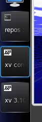 As you see it behaves much better for my usecase. Maybe it should still break the lines where it did before so that actually more text becomes readable. The cool thing is that even for programs where I already know the code it would probably not have taken very much less time to do such a modification. The code is a awesome shape, logically structured and just wonderful hackable. I like that ;)